Quakefinder Blog

QuakeFinder Publishes Peer-reviewed Electro-Magnetic Research

Groundbreaking research covering major faults in California between 2005-2018 examines potential clues in Earth’s magnetic field

QuakeFinder has just published landmark research on earthquake forecasting in Computers & Geosciences, the peer-reviewed academic journal. The study, which examines electromagnetic earthquake precursors covering the major faults in California from 2005 to 2018, advances QuakeFinder’s research into predictive indications in Earth’s magnetic field that may be identified several days prior to an earthquake.

See the Press Release!

The paper, “An algorithmic framework for investigating the temporal relationship of magnetic field pulses and earthquakes applied to California,” has completed peer review and received final acceptance for immediate online publication and will appear in print in the December issue (Volume 133) of the peer-reviewed journal Computers & Geosciences. The paper can be found at https://doi.org/10.1016/j.cageo.2019.104317.

To our knowledge, this is the largest ever study of electromagnetic earthquake precursors to be published and is quite an exciting development for our team that’s been hard at work collecting and analyzing this data for over fifteen years. The data provide hints that earthquake precursors exist in the magnetic field to a statistically significant degree, and this paper represents a major step forward in the challenge faced by QuakeFinder to conclusively demonstrate the existence of these precursor signals and then work towards isolation that will allow individual earthquakes to be forecast.

The treated data set exceeds prior published research by over an order of magnitude, and suggests, with 98.6% (2.2 sigma) confidence, that magnetic field exhibits precursory behavior in the period of four to 12 days prior to earthquakes. While this approach is not yet accurate enough to forecast individual quakes, our research indicates that results will improve with enhanced signal processing.

In comparison, Earthquake Early Warning (EEW) systems based on seismic observations currently provide, at best, seconds of warning before earthquakes. QuakeFinder’s work is poised to transform definitive earthquake forecasting from a science fiction dream into an achievable goal and the team is continuing its work to perform statistically valid research beyond individual quakes or small sample sizes.

QuakeFinder’s Daniel Schneider will present these results at the American Geophysical Union (AGU) conference this December in San Francisco on Friday, December 13, 2019 (Abstract NH52B-05 – QuakeFinder’s Algorithm Results for Forecasting Earthquakes).

Computers & Geosciences publishes high impact, original research at the interface between Computer Sciences and Geosciences. Its articles apply modern computational and informatics-based computer science paradigms to address problems in the geosciences.


Computers and Geosciences Cover Image

32 Day Pulse Plots

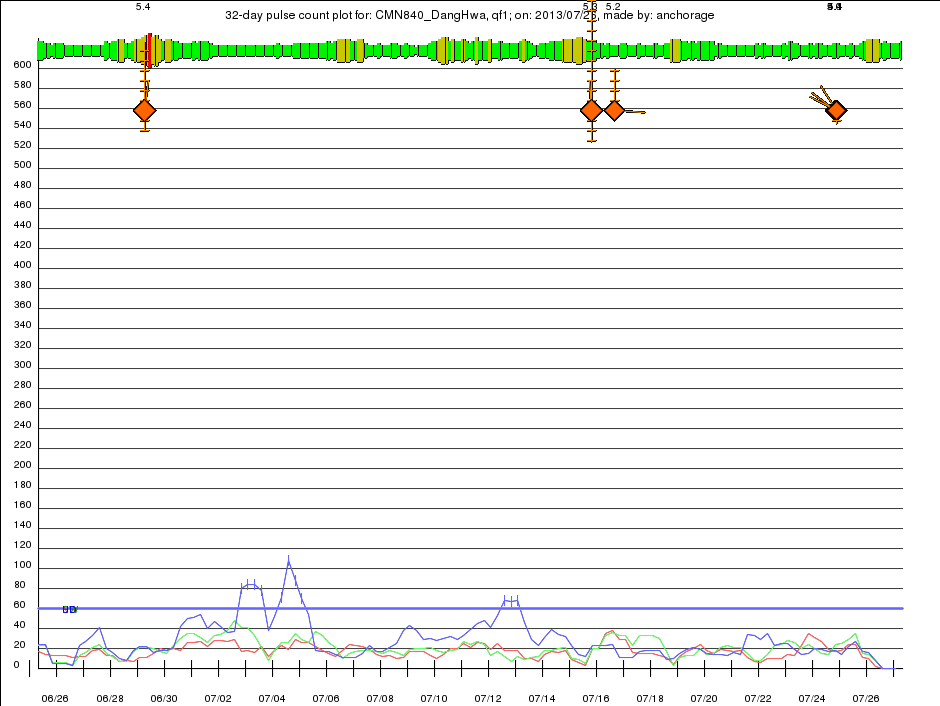
The 32 Day Pulse Plot is created after the Daily Pulse Plot, and mesures the rate of daily pulses. It shows pulse counts of geomagnetic pulses that QuakeFinder has found from the selected site in a 32 day period. There are three traces, red, green, and blue that correspond to the North-South, East-West, and Vertical components of the geomagnetic signal respectively. Each trace shows the count of pulses in a 24-hour period, and there are four points in each day, meaning the 24-hour periods overlap each other by 75% and 128 counts are shown on every plot. When the geomagnetic signal trace pulse counts exceeds the count limit at any time, the QuakeFinder team is notified, triggering further analysis. These limits are constantly being refined, and may change monthly, daily, or hardly at all, depending on how the site behaves. An example from our Dang Hwa site in Taiwan is shown here:
 
 
Layers of the 32 Day Pulse Plot are:

Kp Planetary Activity
      Published by NOAA (The National Oceanic and Atmospheric Administration) as a global value every hour. The level of activity in the Earth’s geomagnetic field is represented by an indicator in the range of 1-3 (Green), 4-6 (Yellow) and 6-9 (Red). The highest levels of activity can generate large signals that are seen across the QuakeFinder network. The Kp indicators are spaced one hour apart and are proportionally taller for higher levels of activity. These are the same as the KP markers on the Daily Pulse Plot, only there are 32x as many on the plot.
Earthquake Markers
      This is a compound Marker that is overlaid onto the geophone trace. In the example above, several m5+ plus earthquakes are shown. The magnitude is written at the top of the plot, and in this example there are two reports in the ANSS catalog, and therefore two markers are drawn here almost on top of each other. The diamond gets larger for larger quakes, but range, depths, and compass bearing are also given by the mark. Range to an earthquake is depicted by the ladder rungs rising above the diamond, in this case the quake is 44 Km from the site. Each ladder rungs denotes 10 Km. Depth is depicted by the down ladder rungs, each also 10 Km spaced. Compass bearing is shown by the lines angled down to the left, in this case the earthquake is to the Southwest of the site. Sometimes multiple quakes occur in rapid succession, and on the scale of 32 days, their markers are so close together that they overwrite each other. This is normal behavior.
Pulse Count Limits
      These are the red, green, and blue horizontal lines that indicate the triggering pulse counts that will alert the QuakeFinder team.
Pulse Count Traces
      These are the red, green, and blue signals that sometimes cross the Pulse Count Limits. These events are know as “Limit Excursions” and they are reported into a database and to the QuakeFinder team. Vertical ticks are added to the traces to indicate that indeed the database entries were made.

Daily Pulse Plots

One of the main earthquake pre-cursors that QuakeFinder is pursuing is to monitor for increases in rate of geomagnetic pulsations. We have published a number of peer-reviewed papers which can be viewed here. The Daily Pulse Plot is an important tool for monitoring pulse activity and shows all three magnetometer channels and the pulses that have been counted in them by our software algorithms (described below and in our papers. Daily Pulse Plots are made by compositing layers onto the Time Series plots.  An example is shown here:


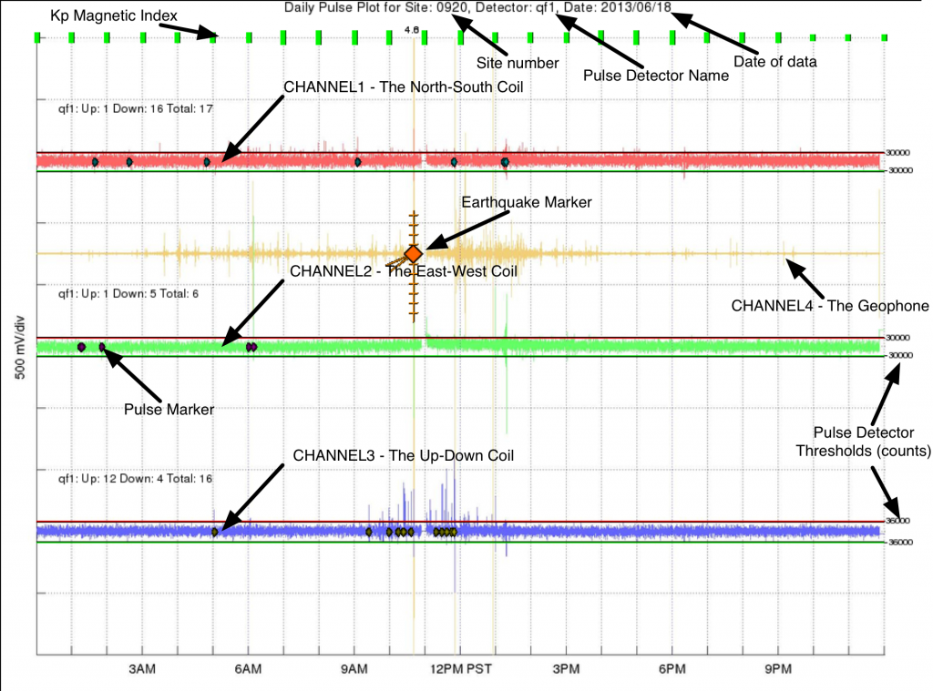
    In this plot, a reboot is shown at 11AM where we did maintenance. Layers composited on the Time Series plot to make the Daily Pulse Plot are:


Kp Planetary Activity
      Published by NOAA (The National Oceanic and Atmospheric Administration) as a global value every hour. The level of activity in the Earth’s geomagnetic field is represented by an indicator in the range of 1-3 (Green), 4-6 (Yellow) and 6-9 (Red). The highest levels of activity can generate large signals that are seen across the QuakeFinder network. The Kp indicators are spaced one hour apart and are proportionally taller for higher levels of activity.
Earthquake Markers
      This is a compound Marker that is overlaid onto the geophone trace. In the example above, an m4.5 earthquake is shown. The magnitude is written at the top of the plot, and in this example there are two reports in the ANSS catalog, and therefore two markers are drawn here almost on top of each other. The diamond gets larger for larger quakes, but range, depths, and compass bearing are also given by the mark. Range to an earthquake is depicted by the ladder rungs rising above the diamond, in this case the quake is 44 Km from the site. Each ladder rungs denotes 10 Km. Depth is depicted by the down ladder rungs, each also 10 Km spaced. Compass bearing is shown by the lines angled down to the left, in this case the earthquake is to the Southwest of the site.
Pulse Markers
      These are tiny diamonds overlaid onto the waveform data. They indicate the that automated detection of a pulse in the data has occurred. See the discussion below for a more complete detection of what a pulse is and how it is detected. For each channel, a pulse count summary is provided up and to the left of the trace. As an example, the annotation for the Blue trace reads ‘qf1: Up: 12 Down : 4 Total: 16. It means that there are sixteen diamonds total overlaid on the blue trace Twelve of them are “Up” pulses, meaning that they protrude up from the signal waveform in the positive direction (up on the plot). The other four pulses are “Down” pulses, meaning that they protrude in the negative (down) direction on the plot.
Pulse Detector Thresholds
      These are the Red (high) and Green (low) above and below the waveform data. These serve as a general visual guide as to whether the waveform has risen high (or low) enough to trigger detailed analysis of the pulse. Not all waveforms that cross these thresholds are cataloged. Some have too short (or too long) a duration. Others are bi-polar (see below). Note also that the small number to the right end of the threshold lines. This is the actual threshold value in 24bit ADC counts, where the range of possible values is 0-2^24.
  In addition to these overlays, the title of the plot contains the number of the QuakeFinder site, in this case 0920, the pulse detector name ‘qf1′, and the date, ’2013/06/18′.
 
 
PULSE DETECTION
 
A pair of thresholds is used to identify pulse events in the magnetometer data. The following cartoon of an “Up” pulse has been published as a simple visual of how it works:
 
 
There are six parameters identified in the above plot:
 
  • + – The pulse detector threshold.
  • T0 – The start time of the pulse.
  • TP – The time of the peak of the pulse.
  • T1 – The end time of the pulse.
  • P – The peak amplitude of the pulse.
  • E – The energy of the pulse.
Controlling these parameters is the key to pulse detection. For example, setting the minimum pulse width allowed (T1T0) is an easy way to block lightning. Details of the pulse detector can be studied in our paper The Pulse Azimuth effect as seen in induction coil magnetometers located in California and Peru 2007–2010, and its Possible Association with Earthquakes
 

Time Series Plots

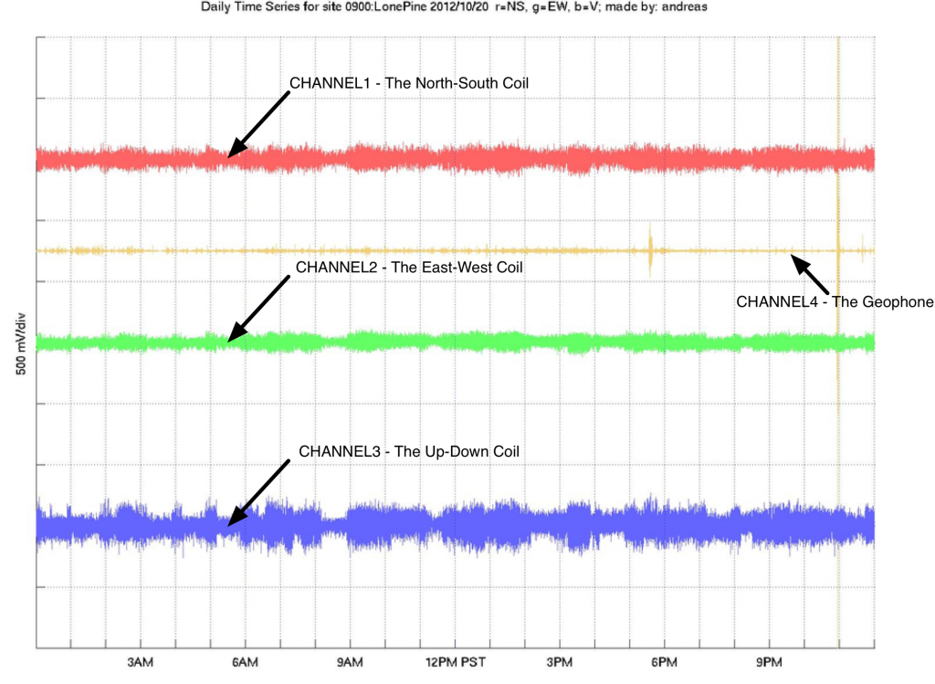
The QuakeFinder Daily Time Series plot shows the three raw magnetometer signals from each site for 24 hours.  The plots are all aligned on Pacific Standard Time midnight, which is eight hours behind Greenwich Mean Time.  Therefore a plot for March 20, 2013 would span from GMT 2013/03/20 08:00:00 to 2013/03/21 08:00:00 on its horizontal axis.  The timestamps on the bottom horizontal axis are in the PST time zone (not daylight savings time).

The vertical axis of the plot is scaled in volts, where each division is 500 millivolts, or 0.5 volts.  The signals have been deliberately offset so as not to be drawn on top of each other, therefore no hard voltage values are listed on the left axis.


Plot trace colors are listed in the order of a computer monitor for easy remembering. Channels 1/2/3 = R/G/B. The Y-axis is 500mv/division (scaled to show some detail in the trace). 1 Volt represents approximately 1 nT (1000pT). The gold trace shows the geophone signal, and often a large shaking from a car or an earthquake will be accompanied by signals in the magnetometers.

Sometimes there are gaps in the data, caused by a reboot, power outage, etc. These are seen as thin straight lines and the absence of signal.